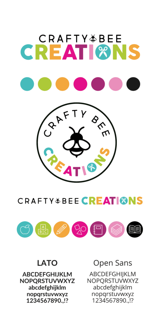
Design Strategy
Laura has a very focused website and product line. She consistently uses bright colors, styled stock photos, and does a great job designing her products. We wanted to keep her Crafty Bee Creations website sleek, bold, and extremely user friendly so visitors could find what they’re looking for, as well as be able to see what Laura has to offer. Keeping the site minimal, in terms of patterns and “busy” elements, allowed Laura’s work to stand out on it’s own.
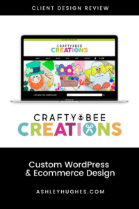
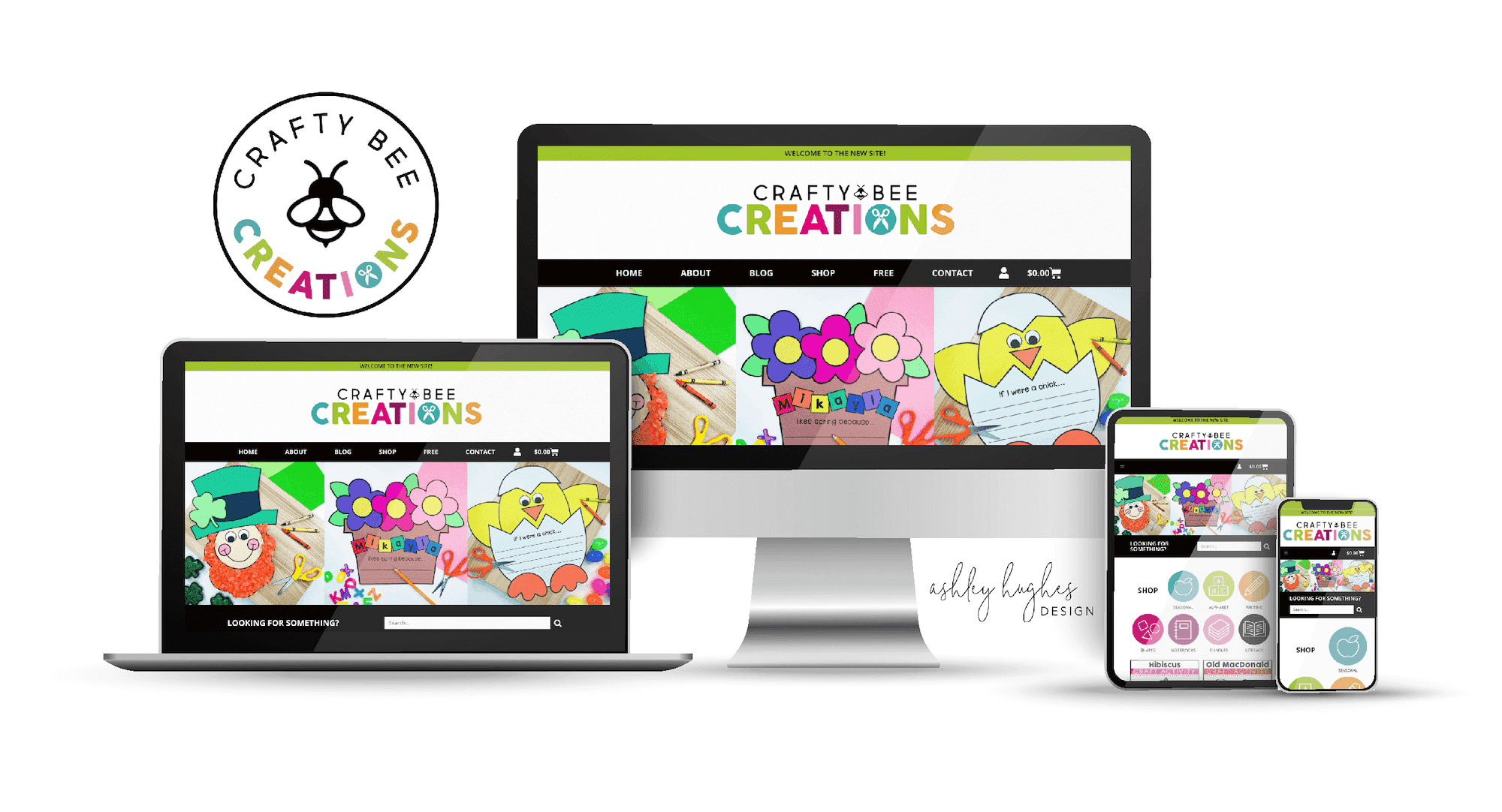
Crafty Bee Creations Homepage
The homepage features:
- A simple header and navigation area, with limited choices, appears at the top. Again, the goal was to make it easy for the visitor to make a choice between her most important site pages. Her previous site had an overwhelming amount of choices, so we simplified.
- The next section is a 3-photo feature area where Laura can showcase her seasonal or featured products. Again, her styled photos are so good we had them become a major part of the design.
- Below that is a simple search bar backed with black so we could break up the two brightly colored sections and create a natural divide.
- Next is her shop section with custom icons and a grid of her 8 newest products.
- Laura uses ConvertKit for her email marketing, so we, again, used the black bar to break up sections, layered her freebie preview over top, and connected the form to her ConvertKit automation.
- Below the opt in is her blog roll with a carousel and button to take visitors to her list of posts. Her featured images double beautifully as Pinterest pins.
- Her Free Resource library is very popular, so we opted for a clean, color-blocked look for the preview mock up and button that links to her ConvertKit landing page she created.
- Next, a short section about Laura puts a face to the brand and allows visitors to see that she’s a credible source and has the experience to back it up. We opted to keep her social media buttons low on the site paired with buttons that allow visitors to learn more about her or get in touch.
- Finally, a simple footer with all the necessary options and in Instagram feed.
Above all, we wanted to keep the site design clean, simple, and showcase her amazing resources. The rest of the site mimics her homepage with the clean structure, pops of color, and bright bold images. This project turned out to be one of my absolute favorites.
Scroll on the preview below to View Laura's Homepage
Homepage
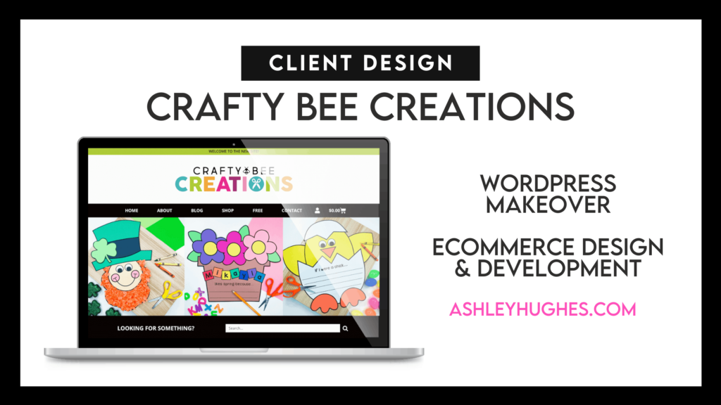
Ecommerce
This ecommerce project was a rather large undertaking. Laura has roughly 1300 products listed in her TeachersPayTeahcers store that she’ll slowly update and add to her site. So, we had to not only plan for her existing content, but also design a shop interface that allowed visitors to easily filter through her products. Some of her shop features include:
- Advanced Filtering
- Custom Fields (File Type, Pages, Grade Levels, Product Preview Link, etc.)
- Social Sharing
- Add to Cart Buttons
- Wishlist Integration
- Resource Sorting
- Shop-Specific Searching
- Custom Templates (Individual Products, Cart, Checkout, Account, etc.)
Shop Page
Individual Product Listing
Additional Features
This site has a large amount of pages, so I can’t showcase them all here. Some of the other features we included were:
- Filterable Blog Roll Page
- Frequently Asked Questions Accordion
- Custom Contact Form
- Custom Blog Post Template
- Free Resource Library (with ConvertKit Automation)
- Advanced Custom Fields
- Custom Post Types
Blog Page
Free Resource Library (Password Protected)
After I design a website, I hand it off to clients and teach them how to edit and manage their site, so things could possibly look a little different now. Just a heads up.
Want to check out more case studies? See more.