Design Strategy
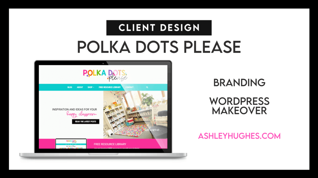
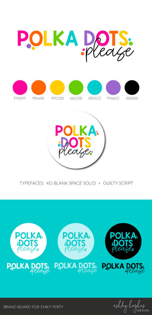
Emily has a growing collection of content and resources. She loves bright colors and has done a great job of keeping her resources “on brand”, so she reached out to me when she felt ready to make the jump to WordPress. She was looking for a “bright and clean” design and a bit of a branding makeover to include brighter colors and more modern look.
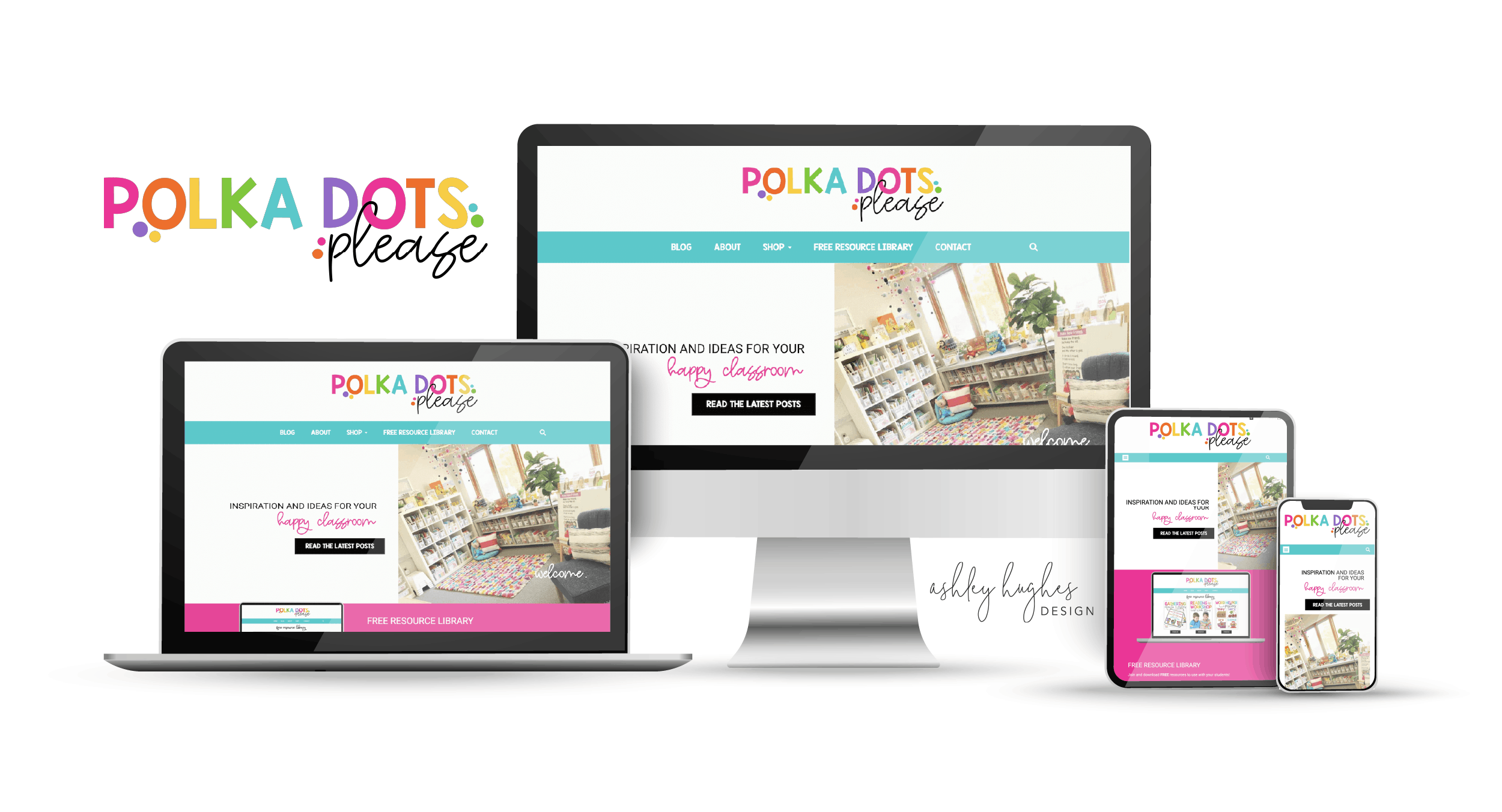
The homepage features:
- A simple header and navigation area, with limited choices, appears at the top. Again, the goal was to make it easy for the visitor to make a choice between her most important site pages. Her logo has a great set of bright colors we were able to work with. We went with teal in the nav bar since that one was the least used in the logo and it was one of the easiest on the eyes in terms of background with white text, as opposed to the pink, orange, or yellow.
- Her elevator pitch is “inspiration and ideas for your happy classroom”, so we showcased a photo of her happy classroom and put a call to action button that leads to her blog.
- After that, there’s an opt in for her free resource library. Visitors sign up and are automatically added to her email marketing automation.
- Featured resources are next. Emily decided to integrate her TeachersPayTeachers shop into her site. She’s able to swap out those featured images and link them to her TpT listings.
- A social media bar is next, creating a great pop of color and divider between the shop and blog roll.
- The blog roll section is decorated with her brand colors in a polka dot pattern… giving a little nod to her brand name. The blog roll is a simple section that highlights her 3 most recent posts and a button to read more. Emily uses very bright stock photos for her featured images as opposed to graphics with text.
- A “Meet Emily” section is next where people can learn a little more about her and put a face to the brand.
- Her Instagram feed adds another section where her brand colors can pop and visitors can see the type of content she’s sharing on social media.
- Lastly, her footer is simple and functional. All the necessary features on a simple light gray background.
Overall, we wanted to keep the site design super clean, bright, and showcase her amazing resources and knowledge. The rest of the site mimics her homepage with the clean structure, pops of color, and bright bold images. Emily was wonderful to work with and I’ve loved continuing to work with her through a maintenance and hosting package.
Scroll on the preview below to View Emily's Homepage
Homepage
Blog
Emily has a growing collection of blog posts and a very focused set of categories. We decided to create a sectioned blog roll with carousels for each topic. Visitors can scroll down to a topic and use the carousel to view posts within that category. It keeps things simple and organized.
Emily also has a custom blog post template that makes it easy on her when writing a blog post, as opposed to Blogger, where she was prior to this project. The template has all of the features like sharing buttons, author box, related posts, navigation, etc. All she has to worry about is creating the content.
Blog Page
Additional Features
This site has several other pages, so I can’t showcase them all here. Some of the other features we included were:
- Password Protected Resource Library
- Custom About Page
- Custom Font Integration
- Contact Page Form
- Shop Dropdown > TpT and Amazon
- Full Screen Search Popup
Free Resource LIbrary
After I design a website, I hand it off to clients and teach them how to edit and manage their site, so things could possibly look a little different now. Just a heads up.