Share this Post


Simplify your website. Gone are the days when visitors stick around for extended periods of time to browse and check out all you have to offer. People are busier than ever and just don’t stick around, on average, as long as they once did. You want to make it easy for visitors to see what you have to offer, show them how to get it, and make the whole process very easy. on top of that, you want to make it simpler on yourself. Whether you’re an informational blog, brick and mortar store, offer resources or courses, or find yourself in another industry, here are 5 ways to simplify your website.
If you’ve had your website for any amount of time, there’s likely a chance you’ve stopped in your tracks and wondered how things got so cluttered, unorganized, or even out of control. From photos and blog drafts to pages and plugins. Simplifying your website can not only make your business life easier and more intentional, but it can help your visitors actually engage with your content.
Here are some simple steps you can take to simplify your website:
1. Simplify and Focus Your Categories
Categories can often get out of hand, especially if your site has been around for a while. When I work with clients who have excessive categories, we go through a process of simplifying. To do this, I have them really focus on what purpose they want their website to serve. Think of your categories and tags as “the forest and trees”. Categories should be the forest (overarching themes), and you don’t need a ton. What is it that you want to be the “go to” for? My main categories are web design, branding, design, business, and tutorials. Tags? You can go nuts with those and don’t need to limit yourself as much as categories.
My categories and tags are all very intentional and match the purpose I have for my business. When I plan and create content I know that it needs to fit into one of my categories. It also really helps Google understand what your site is all about. Think about those main buckets of content or topics that you want to focus on and stick with it. You can add more categories later, but really hone in on those main ones first.
If you have an educational website targeting kindergarten teachers, then having a category about vacation or recipes might not be a great fit anymore. Niching down and narrowing your focus can not only help you serve your intended audience, but it will help you be more intentional about the content you create. Not everything deserves real estate on your website.
2. Delete Unnecessary Content and Plugins
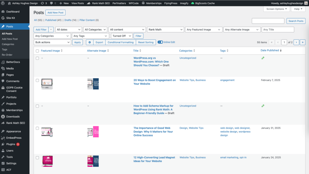
The second tip to simplify your website is to go through your pages, posts, media, plugins, etc. and clean house. Be ruthless. Any content that no longer serves your visitors and niche? Repurpose or redirect it. If you have a habit of uploading multiple versions of photos, drafting a bazillion posts, or creating pages and never publishing them, then I’m looking at you. Any unnecessary content on your site only serves as a distraction to you (and takes up storage space).
I keep a list of posts and content ideas in Airtable. Also, I draft my posts in Google Docs (and also keep a backup there) so that I avoid endless drafts and clutter on my website.
On the plugin topic (WordPress), try and get away with as few plugins as possible. Anything that isn’t totally necessary? Disable and delete. Plugins take up space and can affect your website’s performance f you have an excessive amount.
Note: Make sure when you do clean things up that you redirect any pages or posts that get a significant number of visits (like from Pinterest pins) because that traffic will need to go somewhere, and a 404 page isn’t ideal. You can also rewrite posts if you need to. No shame in updating content.
3. Take Out The Fluff
Another helpful tip for simplifying your website is to get rid of the fluff. Those things that are just there because they’re cute, pretty, or you thought you needed more words (hello 10,000 word blog posts)? Edit. Be concise. People don’t read online as much as they used to, so be careful not to pack your posts and pages with content that isn’t important.
People (and Google) want helpful, quality content. Get to the point and help your visitors acquire the knowledge or information they need, quickly… unless you’re a recipe blogger and ad revenue is killer and you need to tell us about your grandma’s childhood in order for us to truly appreciate your chocolate chip cookie recipe (#scrollingfordays #justgivemethedangrecipe).
4. Make It Easy To Look At (Design)
This one is dear to me, but it’s because I’m very much a visual person. Websites that are cluttered and visually overwhelming do not help your visitors. I can attest to that. When I visit a site that has too much going on (excessive navigation, unclear calls to action, and too many options), I either leave or just mentally check out as I scan the site looking for what I came for.
Simplify your website by making things, especially your homepage, easy to take in and understand. Give your visitors clear calls to action and guide them to what you want them to see. Cramming everything on the homepage isn’t necessary and decision paralysis is a real thing. The main exception to this is big ecommerce sites (they love to cram homepages)…. but that’s likely not you. You are a real person sharing experience, expertise, and products. That approach is much different.
5. Simplify Your Navigation
Navigation is one of the most important components of your website. It’s the first thing your visitors see as they land on your site, and the one thing they’ll see on each and every page. It should not only give them a snapshot of what you have to offer, but it should guide them to where you want them to go. Be strategic about what you put up there. Resist the urge to add every single page or link.
If you have products, you don’t need to add a bazillion categories… just put a “shop” link and the filtering can happen when they land on that page. Like I mentioned above, decision paralysis is real, and having too many options will often encourage your visitors to leave OR just select the easiest path instead of the strategic path you want them to make. Dropdowns are totally fine, just be smart about it.
Typically, 5-7 options at the top is ideal. Those links can then lead to pages that allow visitors to drill down to what they came for. My typical clients have the following navigation items (my typical client is a teacher-blogger-creative). Depending on your niche / industry, your list might be different.
- Home
- About
- Blog
- Shop
- Services/Course
- Contact (usually this is nested under about)
Also, your footer is a very good place to throw your list of links. Most people know that if they want to quickly find your contact page that it will be linked in the footer. Footers usually contain more links than the header, so feel free to go crazy down there.
Simplifying your website takes time and effort, but it will be totally worth it. It will allow you to focus on what you built your business for, and will make your life easier every time you log in.
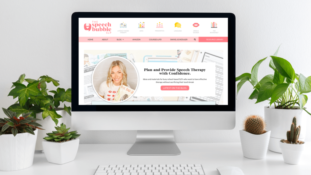
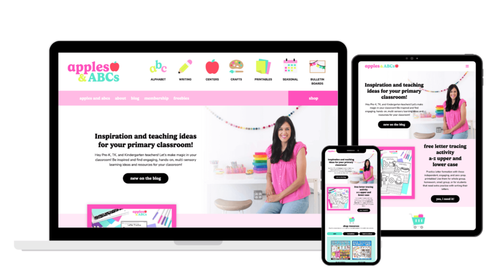
Check out some of my client sites to see how we’ve simplified their navigation, shop, and categories.

Ashley Hughes
I design beautiful branding and graphics, build custom WordPress websites, and handle all the technical stuff so that you can focus on what’s important to your creative business… and stop doing all the things.


Leave a Reply